Global rebrand
Protects What's Good, reloaded
Tetra Pak had set a new company strategy to lead the business into 2030. The brand had to come with it, and it wasn't in a position to: a decade-old design system built for print and one-to-one relationships, a voice that contradicted itself, and a market that now included policymakers, consumers and channels it was never designed for. This rebrand modernised the identity, the design system and the voice, without walking away from the equity that still worked.
Brand
Tetra Pak
Sector
Food and beverage
Role
Brand identity, design system, tone of voice
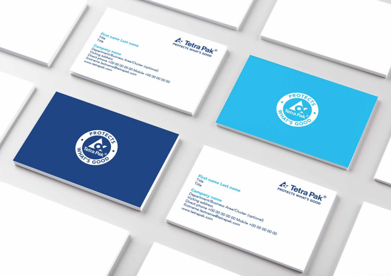
The brief
The brief
Tetra Pak had introduced a new company strategy to lead the business into 2030. The challenge was to bring the brand with it.
Results from the brand health study came back with a consistent sentiment from customers: the design looked a bit old-fashioned.
The research said more than that. Tetra Pak wasn't seen as unique. Its claims sat close enough to its competitors' to be interchangeable. And the vision the company had held for decades, making food safe and available everywhere, was no longer something customers associated with it.
The ground had moved too. Brands now had to be recognisable across touchpoints by more than a logotype. They had to be relatable to audiences the company had never needed to speak to: governments, policymakers, consumers who wanted to know what their choices cost the planet. And the industry was tightening around all of it, with more legislation, thinner margins and more complexity in the value chain.
The identity was a decade old. Built for print and for one-to-one relationships. Not for this.
The approach
The approach
The obvious move was a new colour.
Corporate blue stood for trust and relationships, which are the foundation of the business, and abandoning it would have thrown away the equity that was still working. So we evolved it instead, complementing it with a bright blue that carries energy and vibrancy into a legacy industrial brand.
The design system came out of the promise itself. A package protects what's inside it, so we built the identity from two elements that do the same job. The bright blue box is fixed: it carries the logo and guarantees recognition wherever it appears. The bright blue frame is flexible: it frames an image or holds a message that matters.
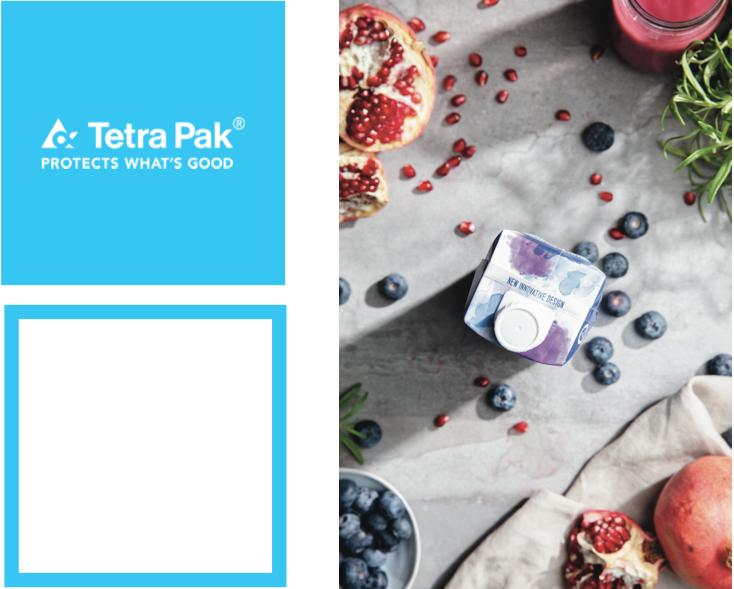
A system to tell stories
A system to tell stories
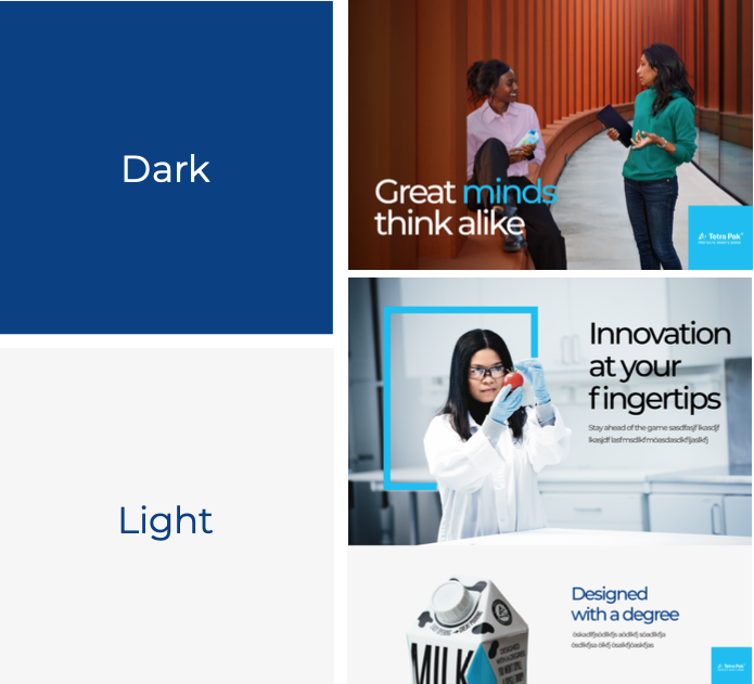
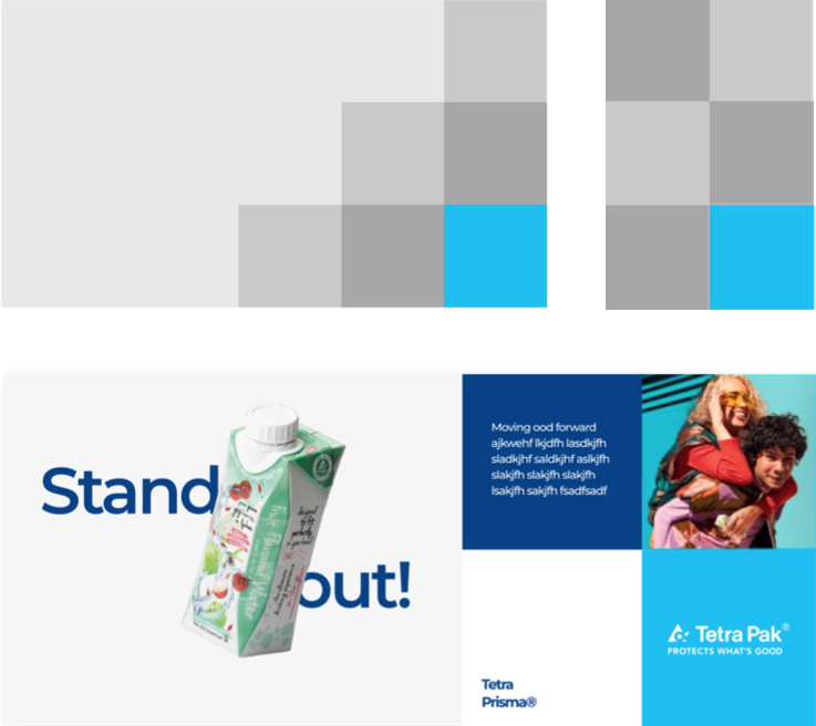
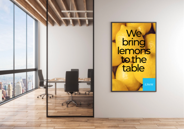
Light and dark colour schemes were defined against both solid and photographic backgrounds so contrast meets accessibility standards without anyone having to think about it. Tiles derived from the box unlocked the potential for multi-image storytelling with a responsive design from the biggest to smallest screens, from events to mobile devices. Typography was modernised to be confident without being loud and expressive without competing against other visual elements.


The Humble Problem-solver
The Humble Problem-solver
Updating the identity also meant revisiting the brand's tone of voice. Like the visual identity, the voice was corporate. And the guideline itself was complex and in places contradicted itself, making it impossible for users to apply it with any impact.
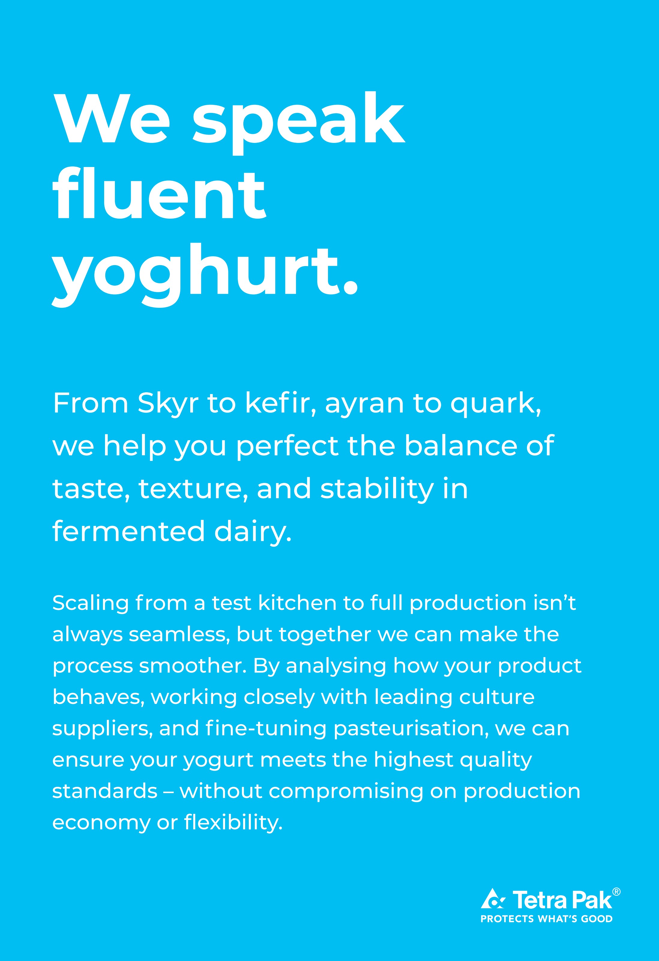
Using IBM Watson, we ran an analysis to understand our customers, culture and the company itself. It told us that customers were technical, curious problem-solvers, and that to reach them we needed to sound more like them. From the company lens came a dual character, engineering confidence sitting alongside genuine modesty.
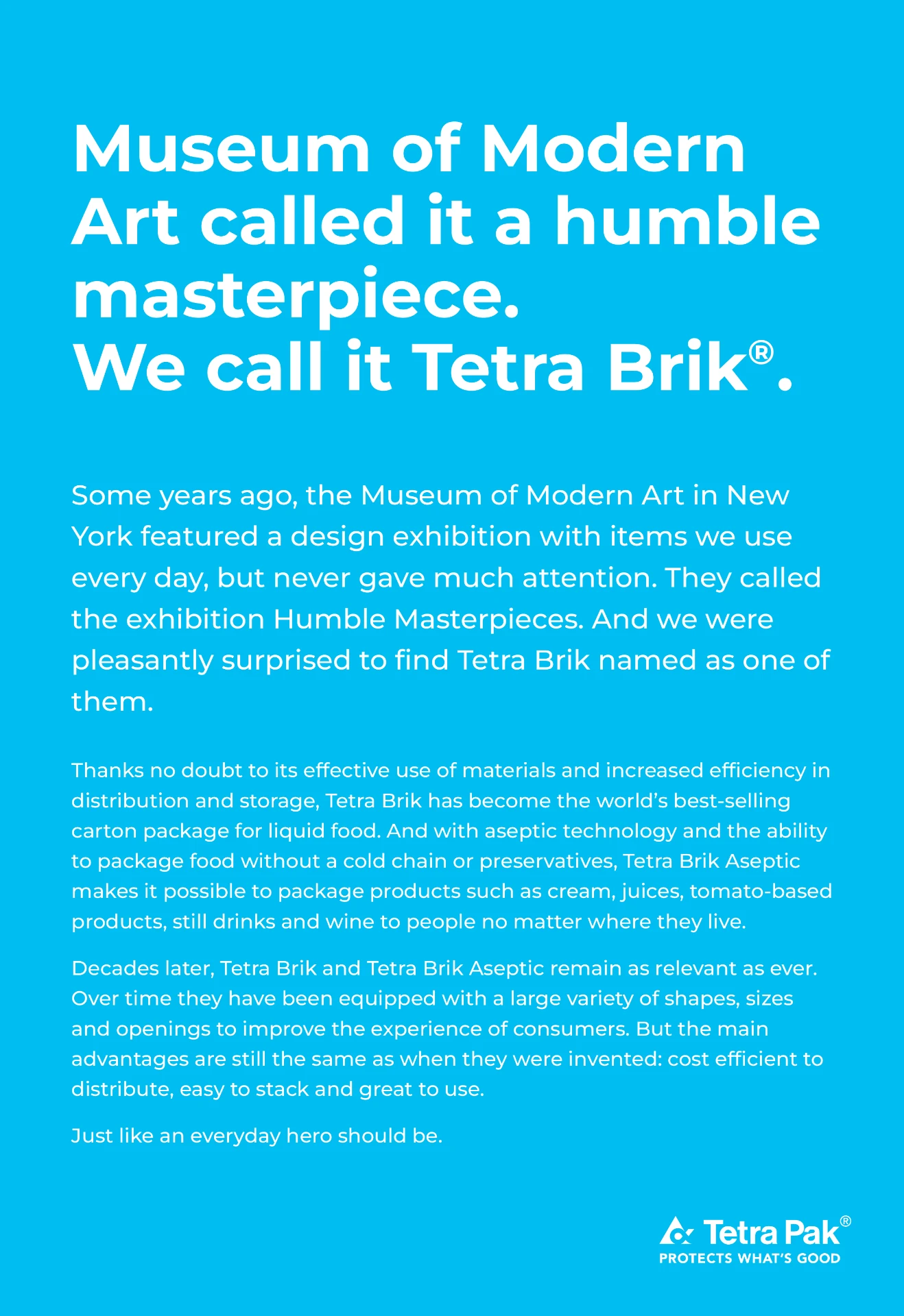
We introduced a new brand voice: The Humble Problem-solver. Human and curious, helpful in sharing expertise and knowledge of how things work, and clever without trying too hard.
The outcome
The outcome
Identity, design system, and voice were rolled out with a governed system across 28 markets, so the new brand landed as something teams could use rather than a document.
+16%
Unaided brand recall
−41%
Time-to-market
Next project
It Starts with Food